
ui-components is a free, open source design & prototyping project written in TypeScript and released under MIT. It has 1,967 GitHub stars, 96 forks and 1 open issues, and was last pushed 11 hours ago. On this registry it ranks #79 of 115 tracked projects in Design & Prototyping, with 5 head-to-head comparisons available.

What is ui-components?

beUI is a free, MIT-licensed collection of animated React and Next.js components built on Tailwind CSS and Framer Motion, distributed through the shadcn CLI so product teams can install individual components or copy their source and own the code.

What it is

beUI is a motion component library for React and Next.js, written in TypeScript and published under the MIT licence. It lives inside the shadcn/ui ecosystem rather than beside it: components are shadcn-compatible registry items addressed through a @beui namespace, the full catalog is served at /r/registry.json, and each item is available as a registry JSON file at /r/{slug}.json with raw source at /r/{slug}/raw. The library is organized into collections covering motion primitives, composed blocks, AI agent interfaces, charts, casino games, and a React Native set, all documented on beui.dev with live previews and copyable usage examples.

The concrete problem it solves is the ownership gap in animated UI. Motion work is either rebuilt from scratch in every product or pulled in as an opaque dependency that the application team cannot reasonably change. beUI ships each component as source that is installed into the app, so the team reads it, edits it, and adapts it to the product — the stated principle is to copy the source and own the code. That replaces the versioned third-party widget package as the delivery model for animated interface pieces, and it gathers into one registry several categories that are normally sourced separately: primitives, composed widgets, data visualizations, AI conversation surfaces, and small games.

Key capabilities

  • Installs any component into a project configured for shadcn/ui through the @beui namespace, for example npx shadcn@latest add @beui/animated-toast-stack, or by passing a direct URL such as https://beui.dev/r/animated-toast-stack.json to the CLI.
  • Supports a manual path as well: the component page exposes the source and supporting files for copying instead of CLI installation.
  • Covers motion primitives such as animated breadcrumbs, color selectors, buttons, tabs, and tooltips, alongside composed blocks including command palettes, file uploads, and signup forms.
  • Provides dedicated collections for AI agent interfaces (chat layouts, prompt inputs, messages, approvals, and tool results), charts (composition, ranking, funnel, calendar, and financial visualizations), and casino games (Crash, Mines, Plinko, and Slide, with fair or server-decided outcomes).
  • Builds motion from springs, shared layouts, and press feedback, with shared animation tokens kept in lib/ease.ts.
  • Includes keyboard behavior and reduced-motion support where applicable, backed by an accessibility-only test suite run with bun test.
  • Exposes the catalog to coding agents through a public MCP server at https://mcp.beui.dev/mcp requiring no license key, with /llms.txt for a documentation index and an installable skill via npx skills add starc007/ui-components --skill beui.

Who uses it and how

  • Product teams building React and Next.js interfaces who want motion on everyday elements such as buttons, navigation, and menus without maintaining an animation layer themselves.
  • Teams shipping AI products, which use the agents collection for chat layouts, prompt inputs, messages, approvals, and tool results rather than designing conversation surfaces from scratch.
  • Teams that need data visualization, drawing on the chart collection for composition, ranking, funnel, calendar, and financial views.
  • Teams building casino-style games, which take Crash, Mines, Plinko, or Slide with either fair or server-decided outcomes.
  • Mobile teams working in Expo and React Native, which use the beUI Native components and preview each one through a clip and an Expo Go preview.

Getting started

In a project already configured for shadcn/ui, add a component with npx shadcn@latest add @beui/animated-toast-stack, or use the direct registry URL shown on the component's page. To work on the library or documentation site locally, install Bun, clone the repository, then run bun install and bun run dev and open http://localhost:3000.

How it compares

beUI positions itself inside the shadcn/ui registry ecosystem as an added namespace rather than as a separate framework, so it complements an existing shadcn/ui setup instead of replacing it. The facts name no other animated component library of this kind, so within this registry it stands alone as the motion-focused counterpart to a shadcn/ui installation.

When to use it — and when not to

Choose beUI when the team wants animation it can read and modify, and when a shadcn/ui-configured React or Next.js codebase already exists to install into. Because components arrive as source rather than as a versioned dependency, upstream fixes and changes reach an application only when someone re-installs or merges them, so the team carries that maintenance itself, and adopting the library means working with Tailwind CSS and Framer Motion. Running the library or documentation site locally also means installing Bun, and teams that want a drop-in package with automatic updates should look elsewhere.

project readme (upstream, from github) — read inline

beUI - Motion Component Library

Animated components for React and Next.js. Copy the source, own the code.

License: MIT GitHub stars CI shadcn compatible

Website · Components · React Native · Changelog · llms.txt
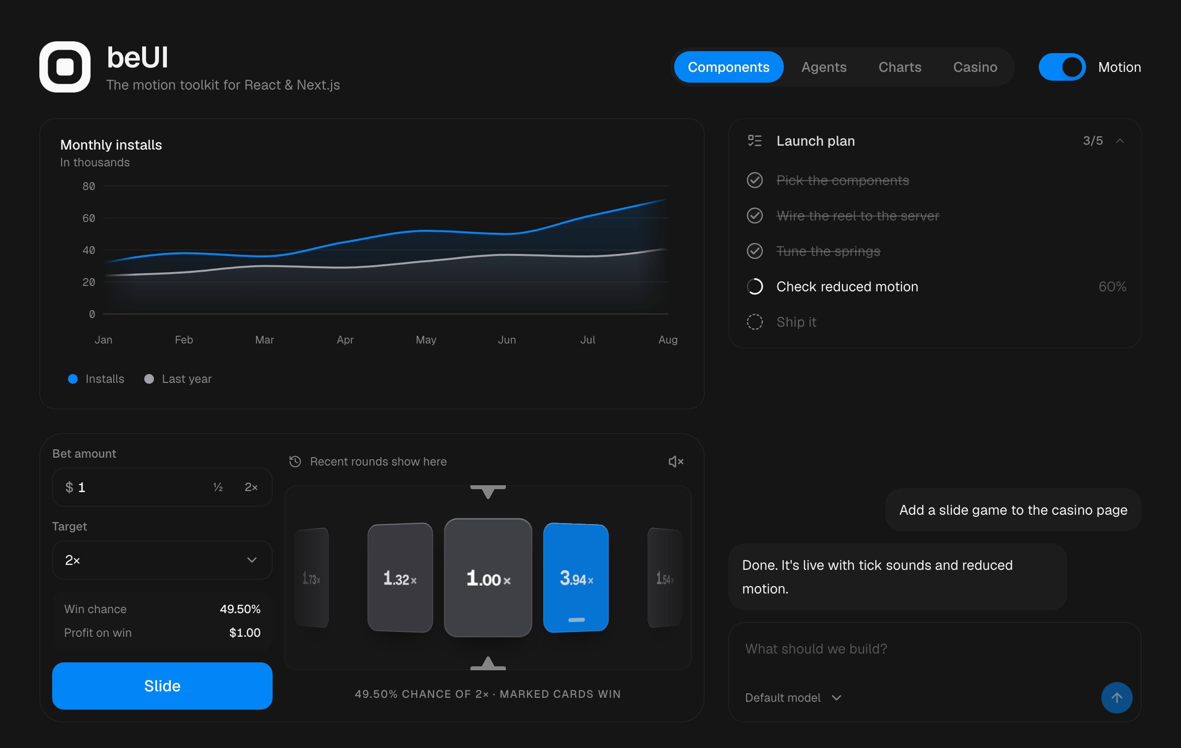
Interfaces that move with intent

beUI brings motion to everyday product interfaces: buttons, navigation, menus, charts, AI conversations, and games. Built with React, TypeScript, Tailwind CSS, and Framer Motion, with live previews and copyable usage examples.

  • Own the source. Install individual components into your app and change them to fit your product.
  • Compose your interface. Combine focused primitives or start with a complete block.
  • Make motion useful. Springs, shared layouts, and press feedback communicate state and keep interactions connected.
  • Keep interaction in reach. Components include keyboard behavior and reduced-motion support where applicable; the project maintains an accessibility test suite.

Explore the library

Collection What you'll find
Components Animated breadcrumbs, color selectors, buttons, tabs, tooltips, and other primitives
Blocks Command palettes, file uploads, signup forms, and composed widgets
AI agents Chat layouts, prompt inputs, messages, approvals, and tool results
Charts Composition, ranking, funnel, calendar, and financial visualizations
Casino Crash, Mines, Plinko, and Slide games with fair or server-decided outcomes
React Native beUI Native components for Expo and React Native, each with a clip and an Expo Go preview

Install a component

In a project configured for shadcn/ui, add a component using the @beui namespace:

npx shadcn@latest add @beui/animated-toast-stack

Direct URLs also work:

npx shadcn@latest add https://beui.dev/r/animated-toast-stack.json

Browse a component's page for its preview, usage example, and exact install command. Prefer a manual setup? Copy its source and supporting files from the page instead.

For AI agents

Connect your coding agent to the public MCP server to discover components and retrieve their source and usage examples. No license key is required:

https://mcp.beui.dev/mcp

See the AI agents guide for client setup. You can also install the beUI skill to help your agent find and compose existing components:

npx skills add starc007/ui-components --skill beui

For direct access without MCP:

Endpoint Contents
/llms.txt Documentation index for agents
/r/registry.json Installable component catalog
/r/{slug}.json shadcn-compatible registry item with source and dependencies
/r/{slug}/raw Raw component source

Run locally

To work on the library or documentation site, install Bun and clone the repository:

git clone https://github.com/starc007/ui-components.git
cd ui-components
bun install
bun run dev

Open http://localhost:3000.

Checks

bun run check
bun test

bun run check runs TypeScript, Biome lint, registry source validation, and message validation. bun test runs the accessibility-only test suite. See CONTRIBUTING.md for the testing policy.

Contributing

Keep component source, previews, and catalog entries together when adding or changing a component:

Location Purpose
components/motion/ Motion primitives and blocks
components/agents/ AI agent interface components
components/charts/ Data visualization components
components/previews/ Demos and public usage examples
lib/registry.ts Component catalog and install metadata
lib/ease.ts Shared animation tokens

Read CONTRIBUTING.md for the contribution and testing workflow, and AGENTS.md for component and motion conventions.

Want complete pages and templates?

beUI Pro includes premium animated sections and full Next.js templates with editable source and private registry access.

Pro customers can install the licensed block workflow:

npx skills add starc007/ui-components --skill beui-pro

Star history

Star history chart for starc007/ui-components

Author

Saurabh Chauhan · @saurra3h

License

MIT. Use and adapt beUI in personal and commercial projects.

Frequently asked questions

Is ui-components free to use?

ui-components is open source under the MIT licence. There is no licence fee and no seat count — you can self-host it or, where the project offers one, pay a vendor for a managed version instead.

What does ui-components do?

beUI: free animated React components built on Framer Motion and Tailwind CSS. Install with the shadcn CLI, or copy the source.

What is ui-components written in?

ui-components is primarily written in TypeScript. Its source is publicly available at https://github.com/starc007/ui-components, and it has 1,967 GitHub stars.