figma-use
⚠️ Figma 126+ blocks remote debugging. figma-use still works via
figma-use daemon start --pipe. Or skip Figma entirely with OpenPencil — an open-source design editor that reads and writes .fig files, with built-in AI and P2P collaboration.
CLI for Figma. Control it from the terminal — with commands or JSX.
# Create and style
figma-use create frame --width 400 --height 300 --fill "#FFF" --layout VERTICAL --gap 16
figma-use create icon mdi:home --size 32 --color "#3B82F6"
figma-use set layout 1:23 --mode GRID --cols "1fr 1fr 1fr" --gap 16

# Or render JSX
echo '<Frame style={{display: "grid", cols: "1fr 1fr", gap: 16}}>
  <Frame style={{bg: "#3B82F6", h: 100}} />
  <Frame style={{bg: "#10B981", h: 100}} />
</Frame>' | figma-use render --stdin --x 100 --y 100
Why
Figma's official MCP plugin can read files but can't modify them. This one can.
LLMs know CLI. LLMs know React. This combines both.
CLI commands are compact — easy to read, easy to generate, easy to chain. When a task involves dozens of operations, every saved token matters.
JSX is how LLMs already think about UI. They've seen millions of React components. Describing a Figma layout as `` is natural for them — no special training, no verbose schemas.
Demo
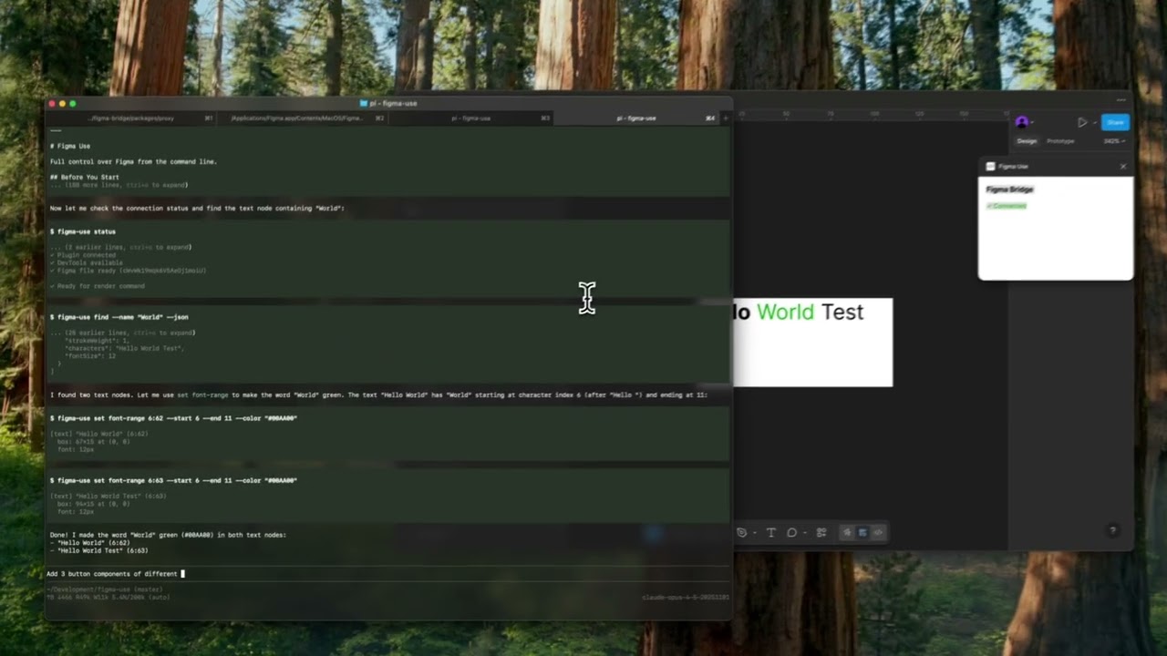
▶️ Button components |
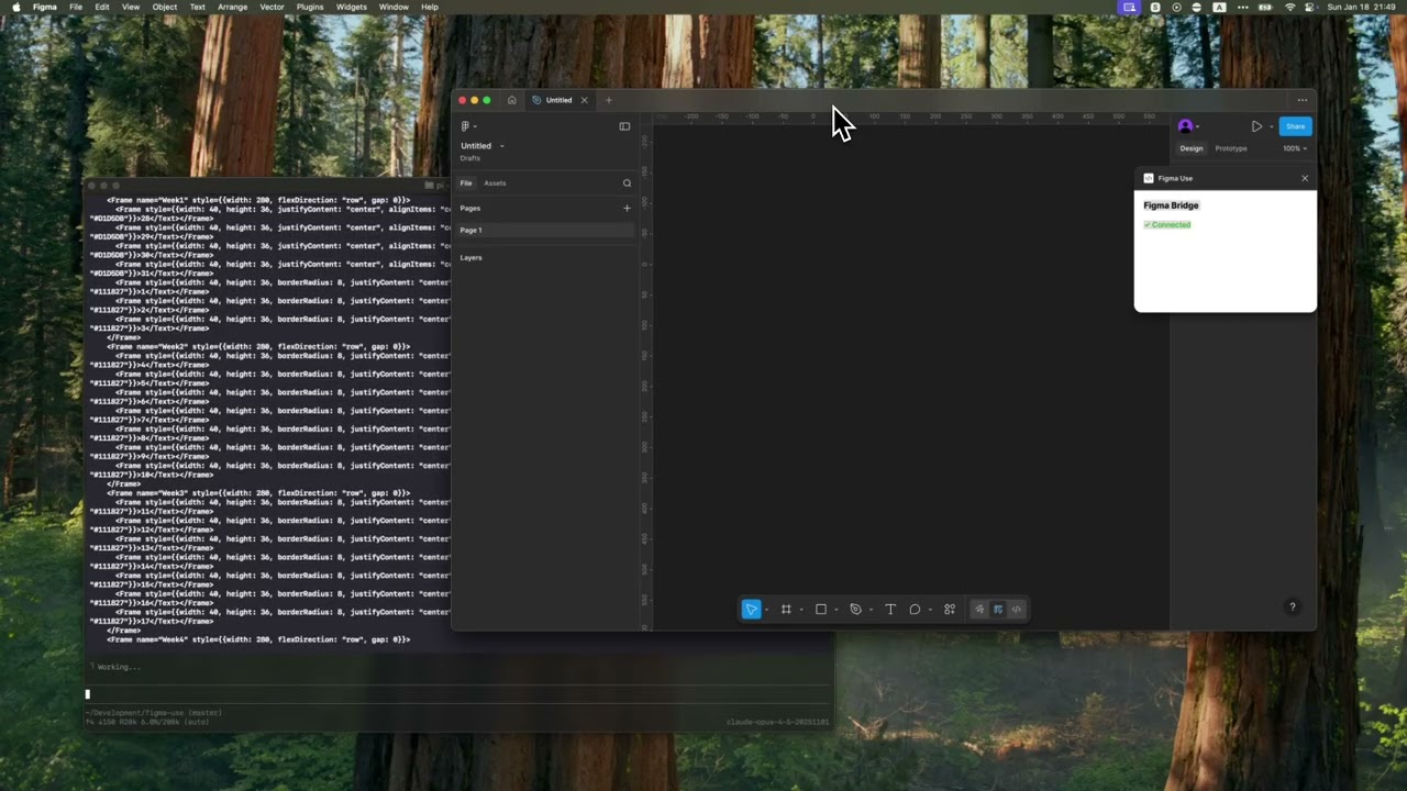
▶️ Tailwind UI calendar |
Installation
npm install -g figma-use
Or run directly without installing:
npx figma-use status
Start Figma with remote debugging enabled:
# macOS
open -a Figma --args --remote-debugging-port=9222

# Windows
"%LOCALAPPDATA%\Figma\Figma.exe" --remote-debugging-port=9222

# Linux
figma --remote-debugging-port=9222
Check connection:
figma-use status
That's it. No plugins to install.
Two Modes
Imperative — one command at a time:
figma-use create frame --width 400 --height 300 --fill "#FFF" --radius 12 --layout VERTICAL --gap 16
Or declaratively — describe the structure in JSX and render it:
echo '<Frame style={{p: 24, gap: 16, flex: "col", bg: "#FFF", rounded: 12}}>
  <Text style={{size: 24, weight: "bold", color: "#000"}}>Card Title</Text>
  <Text style={{size: 14, color: "#666"}}>Description</Text>
</Frame>' | figma-use render --stdin --x 100 --y 200
The stdin mode accepts pure JSX only — no variables, no logic. For components, variants, and conditions, use .figma.tsx files.
Elements: Frame, Rectangle, Ellipse, Text, Line, Star, Polygon, Vector, Group, Icon, Image
Examples
Icons
Insert any icon from Iconify by name. No downloading, no importing, no cleanup.
figma-use create icon mdi:home
figma-use create icon lucide:star --size 48 --color "#F59E0B"
In JSX:
<Frame style={{ flex: 'row', gap: 8 }}>
  <Icon icon="mdi:home" size={24} color="#3B82F6" />
  <Icon icon="lucide:star" size={32} color="#F59E0B" />
</Frame>
Browse 150k+ icons: icon-sets.iconify.design
Images
Load images from URL:
<Image src="https://example.com/photo.jpg" w={200} h={150} />
Export to JSX
Convert any Figma node back to JSX:
figma-use export jsx 123:456 --pretty
Output:
import { Frame, Icon, Text } from 'figma-use/render'
export default function SaveButton() {
  return (
    <Frame name="SaveButton" w={120} h={44} bg="#1FAFBB" rounded={8} flex="row" gap={8}>
      <Icon name="lucide:save" size={18} color="#FFFFFF" />
      <Text size={16} color="#FFFFFF">
        Save
      </Text>
    </Frame>
  )
}
Match vector shapes to Iconify icons automatically:
npm install whaticon  # Optional dependency
figma-use export jsx 123:456 --match-icons --prefer-icons lucide
Compare two nodes as JSX diff:
figma-use diff jsx 123:456 789:012
Export to Storybook (Experimental)
Export components as Storybook stories:
figma-use export storybook --out ./stories
figma-use export storybook --out ./stories --match-icons --prefer-icons lucide
Generates .stories.tsx with typed props from component properties.
Components
In a .figma.tsx file you can define components. First call creates the master, the rest create instances:
import { defineComponent, Frame, Text } from 'figma-use/render'

const Card = defineComponent(
  'Card',
  <Frame style={{ p: 24, bg: '#FFF', rounded: 12 }}>
    <Text style={{ size: 18, color: '#000' }}>Card</Text>
  </Frame>
)

export default () => (
  <Frame style={{ gap: 16, flex: 'row' }}>
    <Card />
    <Card />
    <Card />
  </Frame>
)
Variants
ComponentSet with all combinations:
import { defineComponentSet, Frame, Text } from 'figma-use/render'

const Button = defineComponentSet(
  'Button',
  {
    variant: ['Primary', 'Secondary'] as const,
    size: ['Small', 'Large'] as const
  },
  ({ variant, size }) => (
    <Frame
      style={{
        p: size === 'Large' ? 16 : 8,
        bg: variant === 'Primary' ? '#3B82F6' : '#E5E7EB',
        rounded: 8
      }}
    >
      <Text style={{ color: variant === 'Primary' ? '#FFF' : '#111' }}>
        {variant} {size}
      </Text>
    </Frame>
  )
)

export default () => (
  <Frame style={{ gap: 16, flex: 'col' }}>
    <Button variant="Primary" size="Large" />
    <Button variant="Secondary" size="Small" />
  </Frame>
)
This creates a real ComponentSet in Figma with all 4 variants, not just 4 separate buttons.
Grid Layout
CSS Grid for 2D layouts — calendars, dashboards, galleries:
<Frame
  style={{
    display: 'grid',
    cols: '1fr 1fr 1fr', // 3 equal columns
    rows: 'auto auto', // 2 rows
    gap: 16
  }}
>
  <Frame style={{ bg: '#FF6B6B' }} />
  <Frame style={{ bg: '#4ECDC4' }} />
  <Frame style={{ bg: '#45B7D1' }} />
  <Frame style={{ bg: '#96CEB4' }} />
  <Frame style={{ bg: '#FFEAA7' }} />
  <Frame style={{ bg: '#DDA0DD' }} />
</Frame>
Supports px, fr, and auto/hug. Separate gaps with colGap and rowGap.
In CLI:
figma-use set layout <id> --mode GRID --cols "100px 1fr 100px" --rows "auto" --gap 16
Variables as Tokens
Bind colors to Figma variables by name. The hex value is a fallback:
import { defineVars, Frame, Text } from 'figma-use/render'

const colors = defineVars({
  bg: { name: 'Colors/Gray/50', value: '#F8FAFC' },
  text: { name: 'Colors/Gray/900', value: '#0F172A' }
})

export default () => (
  <Frame style={{ bg: colors.bg }}>
    <Text style={{ color: colors.text }}>Bound to variables</Text>
  </Frame>
)
In CLI, use var:Colors/Primary or $Colors/Primary in any color option.
Diffs
Compare two frames and get a patch:
figma-use diff create --from 123:456 --to 789:012
--- /Card/Header #123:457
+++ /Card/Header #789:013
@@ -1,5 +1,5 @@
 type: FRAME
 size: 200 50
 pos: 0 0
-fill: #FFFFFF
+fill: #F0F0F0
-opacity: 0.8
+opacity: 1
Apply the patch to the original frame. On apply, current state is validated against expected — if they don't match, it fails.
Visual diff highlights changed pixels in red:
figma-use diff visual --from 49:275096 --to 49:280802 --output diff.png
| Before | After | Diff |
|---|---|---|
 |
 |
 |
Inspection
Page tree in readable form:
$ figma-use node tree
[0] frame "Card" (1:23)
    400×300 at (0, 0) | fill: #FFFFFF | layout: col gap=16
  [0] text "Title" (1:24)
      "Hello World" | 24px Inter Bold
Export any node or screenshot with one command.
Arrange
Tidy up canvas layout — especially useful after agents create multiple frames at the same position:
figma-use arrange                              # Grid-arrange all top-level nodes
figma-use arrange --mode row --gap 60          # Horizontal row
figma-use arrange --mode squarify --gap 60     # Smart packing for mixed sizes
Uses d3-hierarchy treemap for squarify and binary modes — size-aware rectangle packing.
Vectors
Import SVG or work with paths directly — read, modify, translate, scale, flip:
figma-use path get <id>
figma-use path set <id> "M 0 0 L 100 100 Z"
figma-use path scale <id> --factor 1.5
figma-use path flip <id> --axis x
Query
Find nodes using XPath selectors:
figma-use query "//FRAME"                              # All frames
figma-use query "//FRAME[@width < 300]"                # Narrower than 300px
figma-use query "//COMPONENT[starts-with(@name, 'Button')]"  # Name starts with
figma-use query "//FRAME[contains(@name, 'Card')]"     # Name contains
figma-use query "//SECTION/FRAME"                      # Direct children
figma-use query "//SECTION//TEXT"                      # All descendants
figma-use query "//*[@cornerRadius > 0]"               # Any node with radius
Full XPath 3.1 support — predicates, functions, arithmetic, axes.
Analyze
Discovery tools for understanding design systems:
# Find repeated patterns (potential components)
figma-use analyze clusters

# Color palette — usage frequency, variables vs hardcoded
figma-use analyze colors
figma-use analyze colors --show-similar    # Find colors to merge

# Typography — all font combinations
figma-use analyze typography
figma-use analyze typography --group-by size

# Spacing — gap/padding values, grid compliance
figma-use analyze spacing --grid 8

# Accessibility snapshot — extract interactive elements tree
figma-use analyze snapshot                 # Full page
figma-use analyze snapshot <id> -i         # Interactive elements only
Example output:
[0] 48× frame "Header" pattern (100% match)
    1280×56 | Frame > [Frame×2, Text]
    examples: 53171:21628, 53171:21704

#303030  ████████████████████ 1840× (var)
#E5E5E5  ████████████████████ 1726× (var)
#000000  ████████ 238×
Lint (Experimental)
Check designs for consistency, accessibility, and best practices:
figma-use lint                          # Recommended rules
figma-use lint --page "Components"      # Lint specific page
figma-use lint --preset strict          # Stricter for production
figma-use lint --preset accessibility   # A11y checks only
figma-use lint -v                       # With fix suggestions
Output:
✖ Header/Title (1:234)
    ✖  Contrast ratio 2.1:1 is below AA threshold (4.5:1)    color-contrast
    ⚠  Touch target 32x32 is below minimum 44x44             touch-target-size

⚠ Card/Body (1:567)
    ⚠  Hardcoded fill color #1A1A1A                          no-hardcoded-colors
    ℹ  Frame with 3 children doesn't use Auto Layout         prefer-auto-layout

────────────────────────────────────────────────────────────────
✖ 1 error  ⚠ 3 warnings  ℹ 1 info
17 rules across 6 categories:
| Category | Rules |
|---|---|
| Design Tokens | no-hardcoded-colors, consistent-spacing, consistent-radius, effect-style-required |
| Layout | prefer-auto-layout, pixel-perfect |
| Typography | text-style-required, min-text-size, no-mixed-styles |
| Accessibility | color-contrast, touch-target-size |
| Structure | no-default-names, no-hidden-layers, no-deeply-nested, no-empty-frames, no-groups |
| Components | no-detached-instances |
JSON output for CI/CD:
figma-use lint --json > report.json
Comment-Driven Workflow (Experimental)
AI agents can wait for Figma comments and respond:
figma-use comment watch --json   # Blocks until new comment
figma-use comment resolve <id>   # Mark as done
Returns comment text, author, and target_node — the exact element under the comment pin. Agent processes the request, resolves the comment, then runs watch again for the next one.
Full Command Reference
See REFERENCE.md for the complete list of 100+ commands.
MCP Server
For AI agents that support Model Context Protocol:
figma-use mcp serve
Exposes 90+ tools. See MCP.md for setup.
Configuration
For Storybook export and linting, create a config file:
figma-use init
Creates .figma-use.json:
{
  "storybook": {
    "page": "Components",
    "out": "./stories",
    "matchIcons": true,
    "preferIcons": ["lucide", "tabler"]
  },
  "lint": {
    "preset": "recommended"
  },
  "format": {
    "pretty": true,
    "semi": false,
    "singleQuote": true
  }
}
CLI arguments override config values.
For AI Agents
Includes SKILL.md — a reference for Claude Code, Cursor, and other agents.
How It Works
┌─────────────┐            ┌─────────────┐
│   Terminal  │────CDP────▶│   Figma     │
│  figma-use  │  port 9222 │             │
└─────────────┘            └─────────────┘
figma-use communicates directly with Figma via Chrome DevTools Protocol (CDP). Just start Figma with --remote-debugging-port=9222 and you're ready.
Non-default port? Pass
--portto any command, or set theFIGMA_PORTenv var:open -a Figma --args --remote-debugging-port=9333 figma-use get components --port 9333 # or FIGMA_PORT=9333 figma-use get components
Commands are executed via Runtime.evaluate in Figma's JavaScript context, with full access to the Plugin API.
Daemon
Optional daemon keeps the CDP connection warm for faster sequential commands:
figma-use daemon start    # Background daemon (~25% faster commands)
figma-use daemon stop     # Stop daemon
figma-use daemon status   # Check if running
Pipe Transport
For Figma 126+ without admin access to patch, the daemon can launch Figma with --remote-debugging-pipe instead:
figma-use daemon start --pipe # Launches Figma, connects via stdio pipes
Set FIGMA_BIN for custom binary locations. The daemon holds the pipe connection — all commands route through it automatically.
License
MIT