tailgrids is a free, open source design & prototyping project written in TypeScript and released under MIT. It has 1,643 GitHub stars, 134 forks and 0 open issues, and was last pushed 2 months ago. On this registry it ranks #62 of 81 tracked projects in Design & Prototyping, with 5 head-to-head comparisons available.

What is tailgrids?

Tailgrids is an open-source React UI component library built with Tailwind CSS that gives frontend developers production-ready components, blocks, and templates for shipping modern web interfaces faster.

What it is

Tailgrids is a React and TypeScript component library styled entirely with Tailwind CSS, distributed as copy-paste source alongside a companion CLI. It lives in the React/Tailwind frontend ecosystem and works with Next.js, Vite, CRA, and all major React frameworks, so a component is installed into a project rather than pulled in as a runtime dependency. Components are fully documented with examples, API references, and accessibility notes, and the library also ships an open-source SVG icon set and a theming system built on modern design tokens.

The problem it addresses is the repeated effort of rebuilding interface primitives from scratch for every new application. The library's stated goal is to let teams build human-centered websites, dashboards, SaaS products, landing pages, and internal tools without reinventing the UI layer, replacing hand-rolled, framework-specific widget code with a single set of tested, consistently designed building blocks. Version 3 was a full rebuild in clean JSX/TSX, and the project describes itself as having no heavy dependencies.

Key capabilities

  • Over 100 free, production-ready React components, including Accordion, Alert, Alert Dialog, Aspect Ratio, Avatar, Badge, Breadcrumbs, Button, Button Group, Card, Carousel, Chart, Checkbox, and Collapsible.
  • More than 500 ready-to-use premium UI blocks covering apps, dashboards, marketing, e-commerce, and AI sections.
  • The @tailgrids/cli tool for instant component installation, with npx @tailgrids/cli@latest init creating config and base styles and npx @tailgrids/cli@latest add button adding a component.
  • Built-in accessibility (a11y), dark mode, responsive design, and keyboard navigation across components.
  • Tailwind CSS styling, so every component is customizable through utility classes rather than a bespoke theme language.
  • A flexible theming system built on modern design tokens.
  • An open-source SVG icon library included with the project.

Who uses it and how

  • React and TypeScript developers adding primitives such as Button to a Next.js, Vite, or CRA project via import { Button } from "@/components/core/button".
  • Teams assembling complete screens from the UI blocks catalog for dashboards, marketing sites, and e-commerce pages rather than composing each section individually.
  • Product engineers shipping SaaS products and internal tools who need dark mode, responsiveness, and keyboard navigation handled in the component itself.
  • Design-system owners who want a copy-paste base they can restyle with Tailwind utility classes instead of maintaining a private widget library.

Getting started

Initialize the project with npx @tailgrids/cli@latest init, then add a component with npx @tailgrids/cli@latest add button; the full installation guide lives at tailgrids.com/docs/installation.

How it compares

Tailgrids stands alone in this registry, and no comparable libraries are named in the available material for a direct comparison.

When to use it — and when not

The trade-off is that it is a source-copy library rather than an installed package, so you maintain the generated component files in your own repository as they are edited to fit your styling. It suits React projects using Tailwind, and is a poor fit for teams standardized on CSS-in-JS, non-React frameworks, or a design language that does not use Tailwind utilities. Review the MIT LICENSE file and the changelog at tailgrids.com/docs/changelog before committing, and note that the documentation, blocks, and templates are hosted on the project's own website rather than fully contained in the repository.

project readme (upstream, from github) — read inline

Free React UI Components Powered by Tailwind CSS

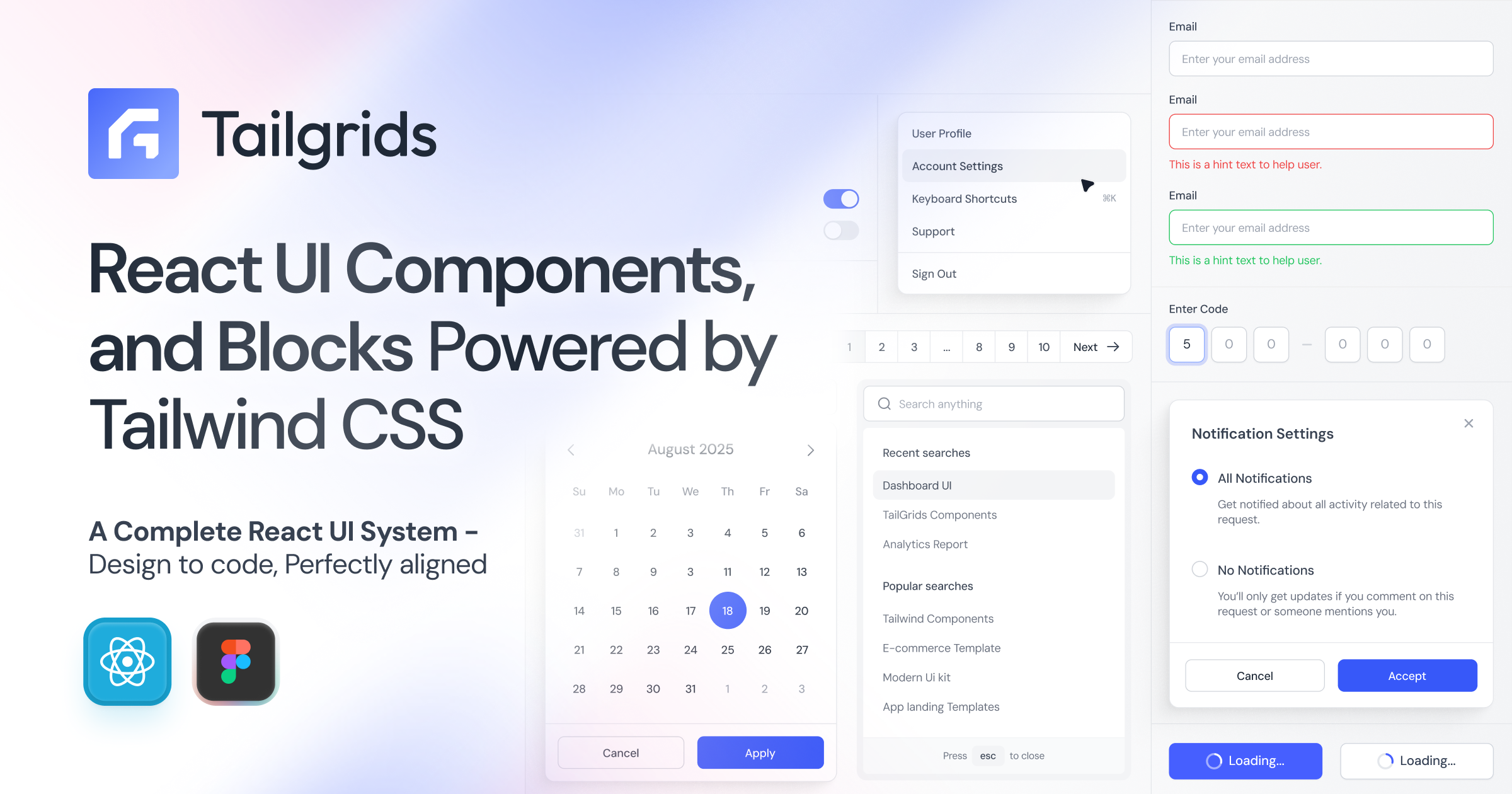
Tailgrids is an open-source React UI component library built with Tailwind CSS. Ship modern web applications faster with an extensive collection of 100+ production-ready, fully customizable, copy-paste friendly components, plus premium UI blocks and templates.
Tailgrids

All components feature a sleek, handcrafted, pixel-perfect design optimized for exceptional UX, high performance, accessibility (a11y), dark mode, and responsiveness.

Build human-centered websites, dashboards, SaaS products, landing pages, and internal tools — without reinventing the UI from scratch.

GitHub stars License Version


📦 Quick Installation

Set up Tailgrids in your React / Next.js project in seconds.

1. Initialize Tailgrids

npx @tailgrids/cli@latest init

This creates the config, base styles, and installs required dependencies.

2. Add Your First Component

npx @tailgrids/cli@latest add button

3. Use It

import { Button } from "@/components/core/button";

export default function Home() {
  return <Button variant="primary">Hello Tailgrids!</Button>;
}

Full installation guide → Tailgrids Installation Docs


✨ Key Features

  • 100+ free React components – Production-ready and actively expanding
  • Premium UI Blocks – 500+ ready-to-use sections for apps, dashboards, marketing, e-commerce, and AI
  • React + TypeScript first-class support – Fully rebuilt in v3 with clean JSX/TSX
  • Powered by Tailwind CSS – 100% customizable with utility classes
  • Tailgrids CLI – Instant component installation
  • Modern design tokens + flexible theming system
  • Built-in accessibility, dark mode, responsive design, and keyboard navigation
  • Works with Next.js, Vite, CRA, and all major React frameworks
  • No heavy dependencies – Lightweight and maintainable
  • Beautiful open-source SVG icon library included

🔗 Essential Links

Resource Link
Website tailgrids.com
Documentation tailgrids.com/docs
All Components tailgrids.com/docs/components
UI Blocks tailgrids.com/blocks
Templates tailgrids.com/templates
Changelog tailgrids.com/docs/changelog
GitHub Repository TailGrids/tailgrids
CLI Documentation Installation Guide

UI Components

100+ free, production-ready React components — categorized for easy browsing.

All components are fully documented with examples, API references, accessibility notes, and copy-paste code.

Core UI Components

Browse the full interactive component library → tailgrids.com/docs/components


🧱 UI Blocks & Templates

  • UI Blocks – Pre-built sections for dashboards, apps, marketing, e-commerce, and AI products → Explore Blocks

  • Templates – Complete, ready-to-use React + Tailwind pages and layouts → Browse Templates


🧠 Built for Developers and Designers

Tailgrids is designed for developers and designers who ship real products:

  • Clean, readable, TypeScript-ready React code
  • Enterprise-ready Figma design system (available for Pro users)
  • Consistent design language across free + premium ecosystem
  • Long-term maintainability and excellent developer experience

📄 License

This project is licensed under the MIT License — free for personal and commercial use.

See LICENSE for details.


❤️ Contributing

We welcome contributions! Feel free to:


Made with ❤️ for the React Tailwind community.

Start building faster today → Get Started

Frequently asked questions

Is tailgrids free to use?

tailgrids is open source under the MIT licence. There is no licence fee and no seat count — you can self-host it or, where the project offers one, pay a vendor for a managed version instead.

What does tailgrids do?

Open-source React UI library built with Tailwind CSS. Production-ready components, blocks, and templates to help you build modern, accessible web apps faster.

What is tailgrids written in?

tailgrids is primarily written in TypeScript. Its source is publicly available at https://github.com/TailGrids/tailgrids, and it has 1,643 GitHub stars.