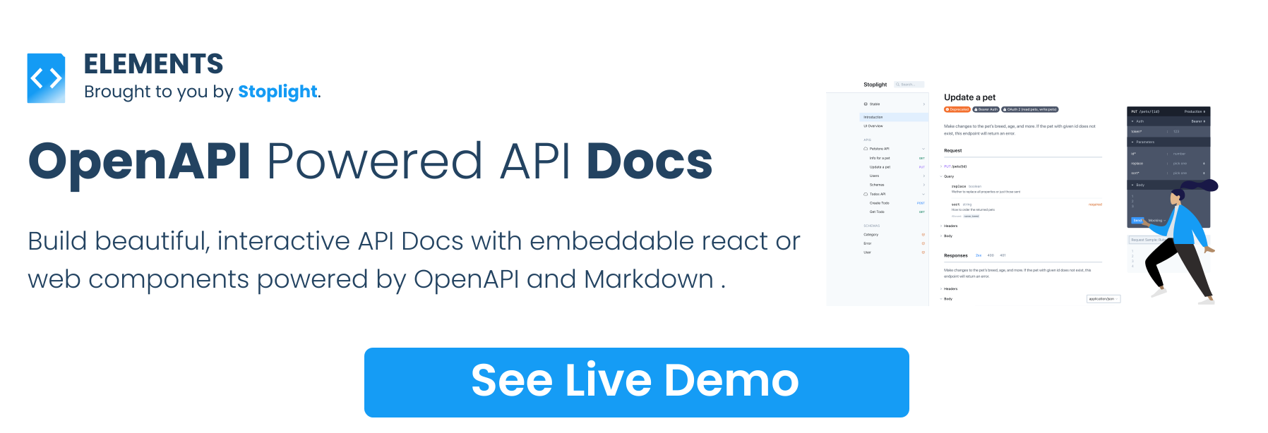
elements is a free, open source api development & testing project written in TypeScript and released under Apache-2.0. It has 2,472 GitHub stars, 257 forks and 276 open issues, and was last pushed 4 days ago. On this registry it ranks #94 of 187 tracked projects in API Development & Testing, with 5 head-to-head comparisons available. It gained 6 stars over the last 30 tracked days.

What is elements?

Stoplight Elements is an Apache-2.0, TypeScript library of embeddable React components and Web Components that turns OpenAPI descriptions and Markdown into interactive API reference documentation, built for API teams that want polished docs inside their own sites, design systems, and content management systems rather than on someone else's hosted platform.

What it is

Elements is a UI component library published from the stoplightio/elements repository. It renders OpenAPI descriptions into browsable API reference documentation and combines that reference with Markdown articles, so tutorials and how-to guides sit alongside the endpoint listings in one experience. The components ship in two distributions from the same source: a React package, and Web Components that mount through a global script tag in plain HTML.

The concrete problem it solves is producing reference documentation without hand-writing an entire docs front end. Instead of building request/response tables, schema viewers, and a request console from scratch, a team points a component at an OpenAPI document and gets the interactive reference. It replaces the custom API documentation UI that teams otherwise assemble themselves, and it does so inside existing sites: Elements supports both a three-column "Stripe-esque" documentation layout and a stacked layout, the latter intended to slot into existing content management systems that already own their own navigation. It lives in the OpenAPI tooling ecosystem, and the topics list ties it to the Stoplight and Swagger open-source lines.

Key capabilities

  • Renders API reference documentation from OpenAPI v2.0, OpenAPI v3.0, and OpenAPI v3.1 descriptions.
  • Ships an API Console, listed in the roadmap as "Try it!", for issuing requests from the documentation page.
  • Generates automatic code samples and automatic examples from the API description.
  • Supports Callbacks, Webhooks, and Multiple APIs, the last described as a "Dev Portal".
  • Available as React Components, mounted with import { API } from "@stoplight/elements", and as Web Components loaded via a global script tag.
  • Pairs OpenAPI reference with Markdown articles covering tutorials and how-to guides.
  • Offers two layouts: the three-column "Stripe-esque" arrangement and a stacked layout designed for integration into existing CMS navigation.

Who uses it and how

  • Front-end teams running Create React App can start from the bundled examples/react-cra project.
  • Angular teams consume the Web Components distribution through the examples/angular project.
  • Teams wanting the smallest possible footprint use examples/bootstrap, a single HTML page that loads the Web Components build through a global script tag.
  • Documentation teams embedding into an existing CMS select the stacked layout so the host site keeps its own navigation.
  • Projects needing one entry point for many APIs use the multiple-API "Dev Portal" arrangement.
  • Stoplight Studio, a free visual OpenAPI designer, uses Elements to preview API descriptions on the fly, and the Stoplight Platform serves hosted documentation powered by Elements.
  • Laravel projects can pull the integration published as juststeveking/laravel-stoplight-elements.

Getting started

Install the React package with npm install @stoplight/elements and import API from it, or load the Web Component build through a global script tag in an HTML page. Package documentation lives at docs/getting-started/elements/react.md and docs/getting-started/elements/html.md, and the bundled examples run with yarn followed by yarn start.

How it compares

The facts provided name no paid products that Elements replaces, so no licence, self-hosting, or cost comparison can be drawn here. Within this registry it stands largely alone among API documentation renderers; the tools named alongside it are its own ecosystem relatives, Stoplight Studio, the hosted Stoplight Platform, and the Laravel integration package, not competing libraries.

When to use it — and when not to

Choose Elements when a site, design system, or CMS already exists and only the API documentation surface is missing, since it renders in the client and nothing in the register entry calls for a database, storage layer, or SMTP server. Teams that want documentation hosted for them, with no front-end work at all, are a poor fit and should look at the hosted Stoplight Platform instead. Two caveats are visible in the facts: the repository carries 276 open issues against 2,464 stars, and the README reserves a section for anonymized analytics, so anyone deploying in a regulated or privacy-sensitive environment should read that section before shipping.

project readme (upstream, from github) — read inline

Elements - OpenAPI Powered API Documentation

Storybook CircleCI NPM Downloads Stoplight Forest

Beautiful API documentation powered by OpenAPI and Markdown. Use these UI components to create API reference documentation, or more complete documentation with Markdown articles covering tutorials, how-to guides, etc.

Available as React Components, or Web Components, you can use Elements all together to build beautiful three-column "Stripe-esque" documentation, or stacked documentation thats easier for integrating into existing Content Management Systems with their own navigation.

Overview

📖 Community

Let's chat about features, ideas, what you're doing with Elements, on GitHub Discussions.

👁️🗨 ️️Examples

Stoplight Elements comes with a few example integration projects, showing you how to utilize Elements with different frameworks.

  • react-cra - An example app built using Create React App utilizing Stoplight Elements.
  • angular - An angular app utilizing the Web Components distribution of Elements.
  • bootstrap - A single HTML page utilizing the Web Components distribution via a global script tag.

To run these examples yourself:

  1. Clone this repo.
  2. Go to examples folder and open an example, e.g.: examples/angular.
  3. Run yarn to install all dependencies.
  4. Run yarn start to run the example.

Note: for bootstrap example just go straight to its directory and open the HTML file.

🏁 Usage

The examples will hopefully help show Elements working in close to real world situations, but the most bare bones examples of Elements can be found below.

React Component

$ npm install @stoplight/elements
import { API } from "@stoplight/elements";

<API
  apiDescriptionUrl="https://api.apis.guru/v2/specs/github.com/1.1.4/openapi.yaml"
  router="history"
/>

For more information on using Elements as a React component, head over to our React documentation.

Web Component

<!doctype html>
<html lang="en">
  <head>
    <meta charset="utf-8">
    <meta name="viewport" content="width=device-width, initial-scale=1, shrink-to-fit=no">
    <title>Elements in HTML</title>
    <!-- Embed elements Elements via Web Component -->
    <script src="https://unpkg.com/@stoplight/elements/web-components.min.js"></script>
    <link rel="stylesheet" href="https://unpkg.com/@stoplight/elements/styles.min.css">
  </head>
  <body>

    <elements-api
      apiDescriptionUrl="https://api.apis.guru/v2/specs/github.com/1.1.4/openapi.yaml"
      router="hash"
      layout="sidebar"
    />

  </body>
</html>

Load this page up in your browser and you should see the GitHub REST API documented in Stoplight Elements.

For more information on using Elements as a Web Component, head over to our Web Component documentation.

🚧 Roadmap

  • API Console (a.k.a "Try it!")
  • Automatic Code Samples
  • Automatic Examples
  • React & Web Component Support
  • OpenAPI Support
    • OpenAPI v3.1
    • OpenAPI v3.0
    • OpenAPI v2.0
  • Callbacks
  • Webhooks
  • Multiple APIs (a.k.a "Dev Portal")

Submit your ideas for new functionality on the Stoplight Roadmap.

⚙️ Integrations

  • Stoplight Studio - Free visual OpenAPI designer that uses Elements to preview your API descriptions on the fly.
  • Stoplight Platform - Collaborative API Design Platform for designing, developing and documenting APIs with hosted documentation powered by Elements.
  • LaravelPHP Elements - A simple API documentation package for Laravel using OpenAPI and Stoplight Elements.

📊 Anonymized analytics

Elements uses Scarf to collect anonymized installation analytics. These analytics help support the maintainers of this library and ONLY run during installation. To opt out, you can set the scarfSettings.enabled field to false in your project's package.json:

// package.json
{
  // ...
  "scarfSettings": {
    "enabled": false
  }
  // ...
}

Alternatively, you can set the environment variable SCARF_ANALYTICS to false as part of the environment that installs your npm packages, e.g., SCARF_ANALYTICS=false npm install.

🏁 Help Others Utilize Elements

If you're using Elements for an interesting use case, contact us for a case study. We'll add it to a list here. Spread the goodness 🎉

👏 Contributing

If you are interested in contributing to Elements itself, check out our contributing docs ⇗ and code of conduct ⇗ to get started.

🎉 Thanks

Elements is built on top of lots of excellent packages, and here are a few we'd like to say a special thanks to.

Check these projects out!

🌲 Sponsor Elements by Planting a Tree

If you would like to thank us for creating Elements, we ask that you buy the world a tree.

Frequently asked questions

Is elements free to use?

elements is open source under the Apache-2.0 licence. There is no licence fee and no seat count — you can self-host it or, where the project offers one, pay a vendor for a managed version instead.

What does elements do?

Build beautiful, interactive API Docs with embeddable React or Web Components, powered by OpenAPI and Markdown.

What is elements written in?

elements is primarily written in TypeScript. Its source is publicly available at https://github.com/stoplightio/elements, and it has 2,472 GitHub stars.