button-card is a free, open source automation project written in TypeScript and released under MIT. It has 2,496 GitHub stars, 280 forks and 31 open issues, and was last pushed 9 days ago. On this registry it ranks #38 of 54 tracked projects in Automation, with 5 head-to-head comparisons available. It gained 1 stars over the last 3 tracked days.

What is button-card?

What it is

button-card is a custom Lovelace card for Home Assistant. It presents entities as configurable buttons and supports many options for appearance, actions, and state display. It lives in the Home Assistant ecosystem, specifically the Lovelace UI, and is distributed as a community custom card with stable and development releases.

The project solves a practical dashboard problem: standard cards may not provide enough control over how an entity is displayed or how a touch interaction behaves. button-card lets dashboard authors define taps, holds, double clicks, icon taps, colors, icons, layouts, labels, and custom state definitions. It also supports actions that call services, navigate, open URLs, show more-info, toggle entities, use assist, or run JavaScript templates.

Key capabilities

  • It works with any entity and can display optional state text, custom icons, and custom sizes for icon, width, and height.
  • It supports tap, hold, and double click actions with none, toggle, more-info, navigate, url, assist, and call-service.
  • It provides separate icon tap actions, momentary press_action and release_action behaviors, and custom actions for javascript, multi-actions, and toast.
  • It supports custom colors, light RGB or temperature based colors, icon and card color types, automatic font color for card color, and custom CSS style.
  • It supports JavaScript templates, custom state definitions, multiple layouts, custom layouts, aspect ratio support, and redefined or hidden sensor units.
  • It includes blank cards, label cards, blink animation, icon rotation animation, confirmation popups, password or PIN protection, and haptic support for the Home Assistant iOS companion app.
  • It supports HACS installation and has stable and development documentation links.

Who uses it and how

  • Home Assistant users add it to Lovelace dashboards to display entities as buttons.
  • Users assign toggle, call-service, navigate, URL, or assist actions to tap, hold, or double click.
  • Dashboard authors use blank cards, label cards, custom layouts, and CSS to organize dashboards.
  • Advanced users use JavaScript templates, custom state definitions, and multi-actions to change icon, color, text, or behavior based on entity state.
  • Users protect sensitive actions with confirmation popups, password or PIN protection, and haptic feedback on supported iOS devices.

Getting started

Install it through HACS as a custom card, then add it to a Lovelace dashboard and configure it. Use the stable documentation for normal use and the development documentation for beta behavior.

When to use it — and when not to

Use button-card when a Home Assistant dashboard needs customized entity buttons and actions beyond basic Lovelace cards. Avoid it when simplicity matters, because many options, JavaScript templates, and custom CSS can increase maintenance. It depends on Home Assistant and custom card installation.

project readme (upstream, from github) — read inline

Button Card by @RomRider


Stable Beta HACS Badge Project Maintenance
Downloads GitHub Activity License Discord Community Forum

Useful links

What is custom:button-card?

This is a lovelace custom card called button-card for your entities with a LOT of configuration options.
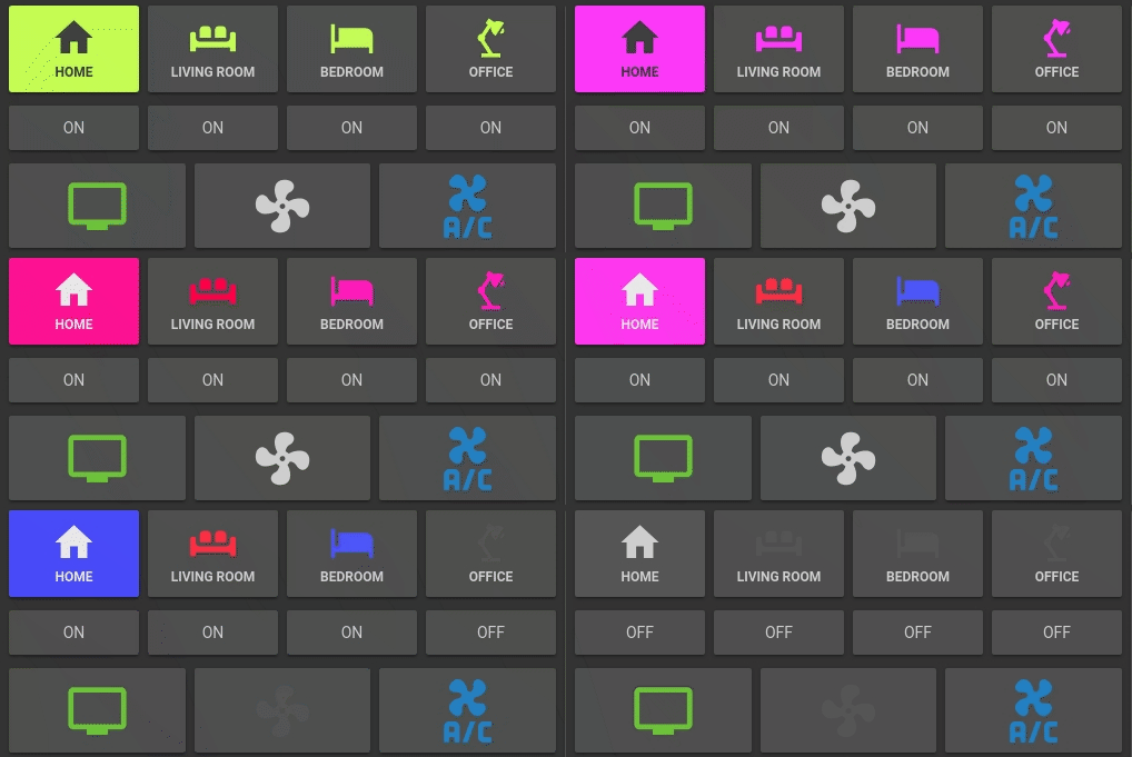
all

  • works with any entity
  • 6 available actions on tap and/or hold and/or double click: none, toggle, more-info, navigate, url, assist and call-service
  • icon tap action: Separate action when clicking the icon specifically which takes precedence over main card actions.
  • momentary actions for the card and/or icon: press_action and release_action (if used, replaces default actions)
  • 3 button-card custom actions: javascript, multi-actions, toast
  • state display (optional)
  • custom color (optional), or based on light rgb value/temperature
  • custom state definition with customizable color, icon and style
  • custom size of the icon, width and height
  • aspect ratio support
  • Support for javascript templates
  • custom icon
  • custom css style
  • multiple layout support and custom layout support
  • units for sensors can be redefined or hidden
  • 2 color types
    • icon : apply color settings to the icon only
    • card : apply color settings to the card only
  • automatic font color if color_type is set to card
  • blank card and label card (for organization)
  • Native blink animation support
  • icon rotation animation support
  • confirmation popup for sensitive items or locking mecanism
  • password or PIN protection for actions
  • haptic support for the IOS companion App
  • support for HACS

Frequently asked questions

Is button-card free to use?

button-card is open source under the MIT licence. There is no licence fee and no seat count — you can self-host it or, where the project offers one, pay a vendor for a managed version instead.

What does button-card do?

❇️ Lovelace button-card for home assistant

What is button-card written in?

button-card is primarily written in TypeScript. Its source is publicly available at https://github.com/custom-cards/button-card, and it has 2,496 GitHub stars.