Balloon
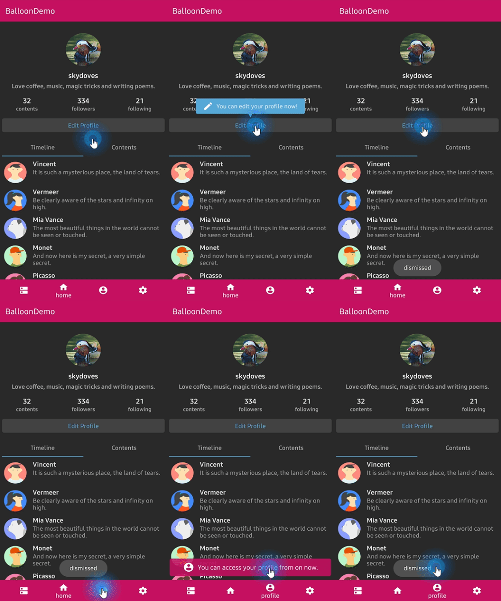
:balloon: Modernized and sophisticated tooltips for Compose Multiplatform, fully customizable with an arrow and animations.












Who's using Balloon?
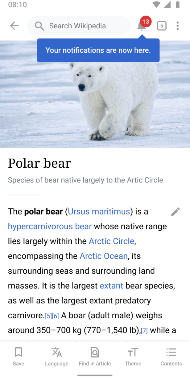
👉 Check out who's using Balloon
Balloon hits +800,000 downloads every month around the globe! :balloon:


What's new in 2.0.0
Balloon 2.0.0 is a full rewrite on Compose Multiplatform. One artifact now runs on Android,
iOS, Desktop (JVM), and Web (Wasm), and everything is drawn by Compose instead of a
PopupWindow. There is no Context, no View, and no XML anywhere in the API.
If you are coming from 1.x, read the Migration guide from 1.x to 2.0.0.
The View based implementation is still available at version 1.7.6, documented under
Balloon 1.x (View).
💝 Sponsors

Including in your project

Gradle
Add the dependency below to your module's build.gradle.kts file.
Compose Multiplatform
kotlin {
    sourceSets {
        commonMain.dependencies {
            implementation("com.github.skydoves:balloon:2.0.1")
        }
    }
}
Android only
dependencies {
    implementation("com.github.skydoves:balloon:2.0.1")
}
Supported targets: android, jvm (Desktop), iosArm64, iosSimulatorArm64, iosX64, wasmJs.
How to Use
A balloon is made of two things: a style that describes how it looks, and a state that decides when it shows.
val style = rememberBalloonBuilder {
    setArrowSize(10.dp)
    setArrowPosition(0.5f)
    setWidthRatio(0.7f)
    setPadding(12.dp)
    setCornerRadius(8.dp)
    setBackgroundColor(Color(0xFF785EF0))
    setBalloonAnimation(BalloonAnimation.ELASTIC)
}

val balloonState = rememberBalloonState(style)
Then attach it to an anchor. There are two ways to do that.
Balloon composable
Wrap the anchor with the Balloon composable. The balloon body goes in balloonContent, and
the anchor goes in the trailing lambda.
Balloon(
    state = balloonState,
    balloonContent = {
        Text(
            text = "Now you can edit your profile!",
            color = Color.White,
        )
    },
) {
    Button(onClick = { balloonState.showAlignTop() }) {
        Text(text = "Edit profile")
    }
}
Modifier.balloon
If you would rather decorate an existing composable than wrap it, use Modifier.balloon. It
needs a BalloonHost somewhere above it, which is what actually renders the popup and the
overlay scrim.
BalloonHost {
    Column(verticalArrangement = Arrangement.spacedBy(16.dp)) {
        Button(
            modifier = Modifier.balloon(balloonState) {
                Text(text = "Now you can edit your profile!", color = Color.White)
            },
            onClick = { balloonState.showAlignTop() },
        ) {
            Text(text = "Edit profile")
        }
    }
}
Wrap your screen in BalloonHost once and every Modifier.balloon below it works. Forgetting
it throws an exception that says so, instead of silently rendering nothing.
Showing and dismissing
BalloonState is the single place that controls visibility.
balloonState.showAlignTop()  // above the anchor
balloonState.showAlignBottom()  // below the anchor
balloonState.showAlignStart()  // leading side
balloonState.showAlignEnd()  // trailing side
balloonState.showAsDropDown()  // below, leading edges aligned
balloonState.showAtCenter(BalloonCenterAlign.TOP)
balloonState.show(BalloonAlign.BOTTOM, xOffset = 8.dp, yOffset = 4.dp)

balloonState.toggle()
balloonState.dismiss()
balloonState.update(BalloonAlign.TOP)  // move without replaying the animation
balloonState.dismissWithDelay(scope, 1_500L)

balloonState.isVisible  // observable in composition
Every show has a suspend twin that returns once the balloon is dismissed, which makes
sequences easy to write.
LaunchedEffect(Unit) {
    firstBalloon.awaitAlignTop()
    secondBalloon.awaitAlignBottom()
    thirdBalloon.awaitAtCenter(BalloonCenterAlign.END)
}
Positioning


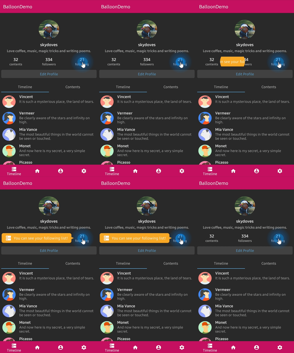
The arrow edge is derived from the alignment you show with, so it always points back at the anchor without you naming it. When the requested side has no room and the opposite side does, the balloon flips over and the arrow follows it. A final clamp keeps the balloon inside the window.
To pin the arrow to a specific edge regardless of placement:
setArrowOrientation(ArrowOrientation.TOP)
setArrowOrientationRules(ArrowOrientationRules.ALIGN_FIXED)
Arrow
setIsVisibleArrow(true)
setArrowSize(10.dp)  // square
setArrowSize(width = 16.dp, height = 8.dp)  // base and protrusion
setArrowPosition(0.62f)  // 0f..1f along the edge
setArrowPositionRules(ArrowPositionRules.ALIGN_ANCHOR)
setArrowColor(Color.White)
ALIGN_BALLOON reads arrowPosition as a fraction of the balloon, and ALIGN_ANCHOR reads it
as a fraction of the anchor, so the arrow keeps pointing at the same spot on the anchor wherever
the balloon lands. Under ALIGN_ANCHOR the arrow is kept
arrowSize * arrowAlignAnchorPaddingRatio + arrowAlignAnchorPadding clear of the balloon's ends.
Size and spacing
setWidth(200.dp)  // fixed
setWidthRatio(0.6f)  // fraction of the window
setMinWidth(120.dp)
setMaxWidth(320.dp)
setMinWidthRatio(0.3f)
setMaxWidthRatio(0.9f)
setHeight(120.dp)
setSize(width = 200.dp, height = 120.dp)

setPadding(12.dp)
setPadding(start = 8.dp, top = 4.dp, end = 8.dp, bottom = 4.dp)
setPaddingHorizontal(16.dp)
setPaddingVertical(8.dp)

setMargin(12.dp)
setMarginHorizontal(16.dp)
setElevation(2.dp)
Width and height specs size the whole popup box, which is the visible card plus the margins and
the elevation inset. Set setElevation(0.dp) and no margin if you want the card itself to be
exactly the size you asked for.
Colors and border
setBackgroundColor(Color(0xFF785EF0))
setArrowColor(Color.White)  // Color.Unspecified inherits the background
setCornerRadius(12.dp)
setBorder(color = Color.White, thickness = 2.dp)
setAlpha(0.9f)
The border traces the real silhouette, arrow included, at exactly the thickness you asked for.
Overlay


An overlay dims the whole window and cuts the anchor out of it, which is how you build a spotlight tour.
setIsVisibleOverlay(true)
setOverlayColor(Color(0x99000000))
setOverlayPadding(6.dp)
setOverlayShape(BalloonOverlayShape.RoundRect(radiusX = 12.dp, radiusY = 12.dp))
setBalloonOverlayAnimation(BalloonOverlayAnimation.FADE)
setDismissWhenOverlayClicked(true)
Shapes available: Empty, Rect, Oval, Circle(radius), RoundRect(radiusX, radiusY), and
RoundRectPerCorner(topStart, topEnd, bottomEnd, bottomStart).
A balloon with an overlay must sit under a BalloonHost, because a popup cannot cover the
system bars. The scrim fills the host's own bounds, so put BalloonHost at the root of an
edge-to-edge window with Modifier.fillMaxSize() if you want it to dim the whole screen.
Animations


setBalloonAnimation(BalloonAnimation.ELASTIC)  // NONE, FADE, OVERSHOOT, ELASTIC, CIRCULAR
setCircularDuration(500L)
The durations, interpolators, and pivots are ports of the original animation resources, so the motion is identical on every platform.
Highlight animations

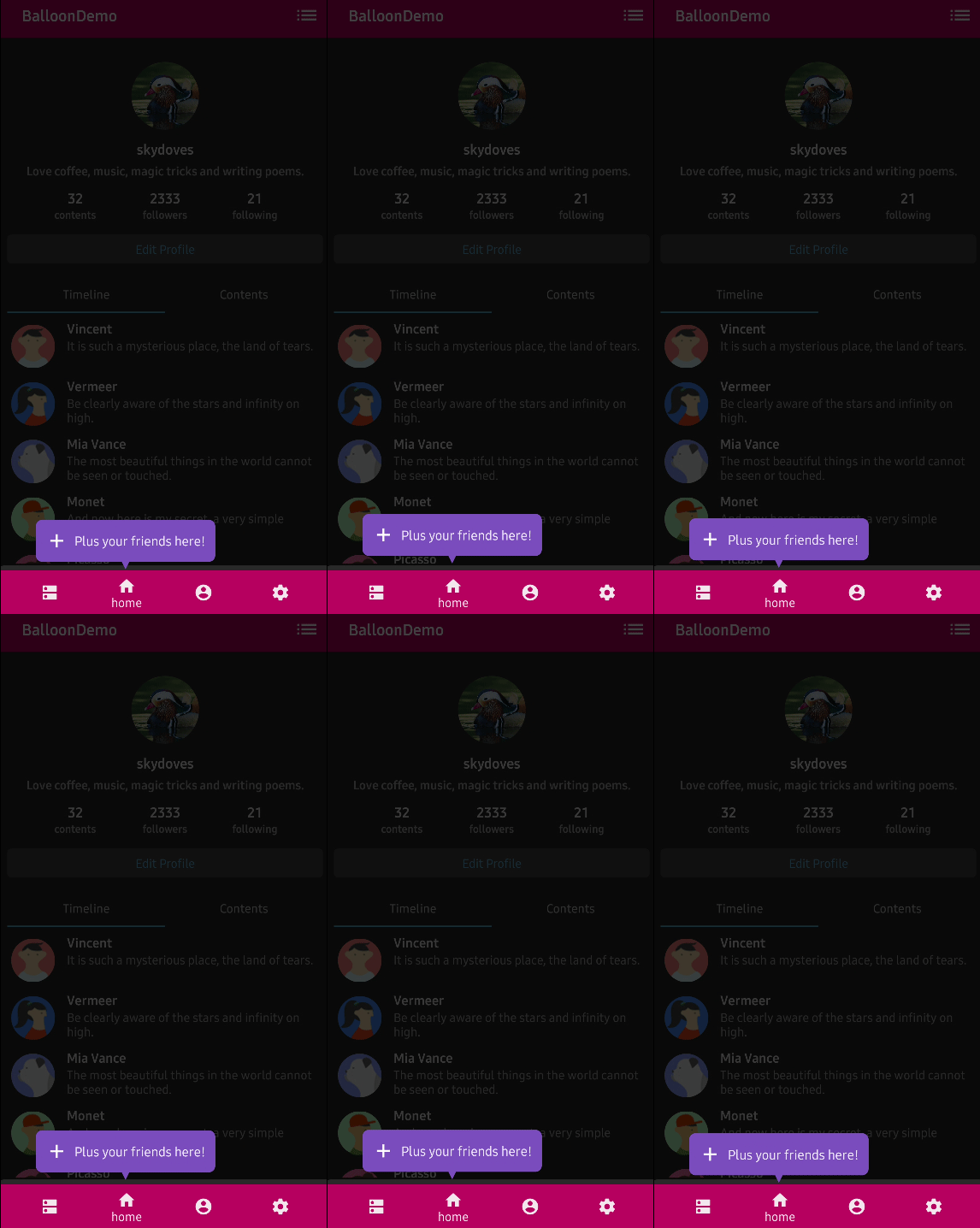


A looping animation that plays while the balloon is showing, to draw the eye.
setBalloonHighlightAnimation(BalloonHighlightAnimation.HEARTBEAT, startDelayMillis = 300L)
NONE, HEARTBEAT, SHAKE, BREATH, and ROTATE. ROTATE takes its parameters from
setBalloonRotationAnimation(BalloonRotateAnimation(turns = 2, speedMillis = 1200)).
Listeners
Listeners are properties on the state rather than builder options, because BalloonStyle is
value equal data and lambdas would break that.
balloonState.onBalloonClick = { /* the body was tapped */ }
balloonState.onOverlayClick = { /* the scrim was tapped */ }
balloonState.onDismiss = { /* the balloon closed */ }
Behavior
setDismissWhenClicked(true)
setDismissWhenTouchOutside(true)
setDismissWhenBackPressed(true)
setDismissWhenShowAgain(true)
setAutoDismissDuration(2_000L)
setFocusable(true)
Custom content
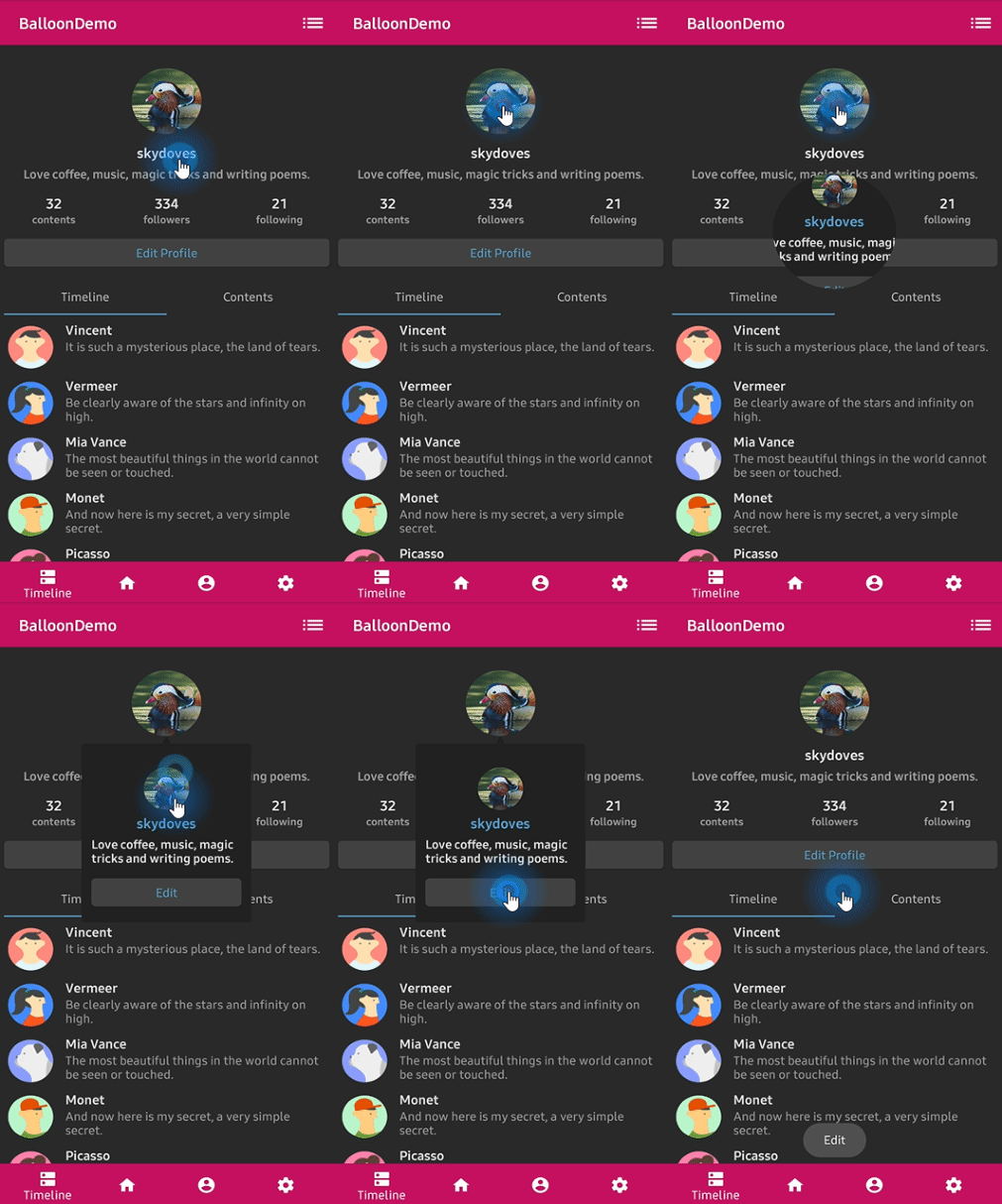
There is no TextForm, no IconForm, and no setLayout. The balloon body is a Compose slot, so
you build it the same way you build anything else.
Balloon(
    state = balloonState,
    balloonContent = {
        Row(verticalAlignment = Alignment.CenterVertically) {
            Icon(imageVector = Icons.Default.Edit, contentDescription = null, tint = Color.White)
            Spacer(modifier = Modifier.width(8.dp))
            Text(text = "Edit your profile", color = Color.White)
        }
    },
) {
    ProfileImage(onClick = { balloonState.showAlignBottom() })
}
Documentation
For a full reference of every option, see the documentation.
- Getting Started
- Showing a Balloon
- Arrow
- Size and Spacing
- Customization
- Overlay
- Animation
- Listeners
- Migration from 1.x
- Balloon 1.x (View)
Find this library useful? :heart:
Support it by joining stargazers for this repository. :star:
Also, follow me on GitHub for my next creations! 🤩
License
Designed and developed by 2019 skydoves (Jaewoong Eum)

Licensed under the Apache License, Version 2.0 (the "License");
you may not use this file except in compliance with the License.
You may obtain a copy of the License at

    http://www.apache.org/licenses/LICENSE-2.0

Unless required by applicable law or agreed to in writing, software
distributed under the License is distributed on an "AS IS" BASIS,
WITHOUT WARRANTIES OR CONDITIONS OF ANY KIND, either express or implied.
See the License for the specific language governing permissions and
limitations under the License.