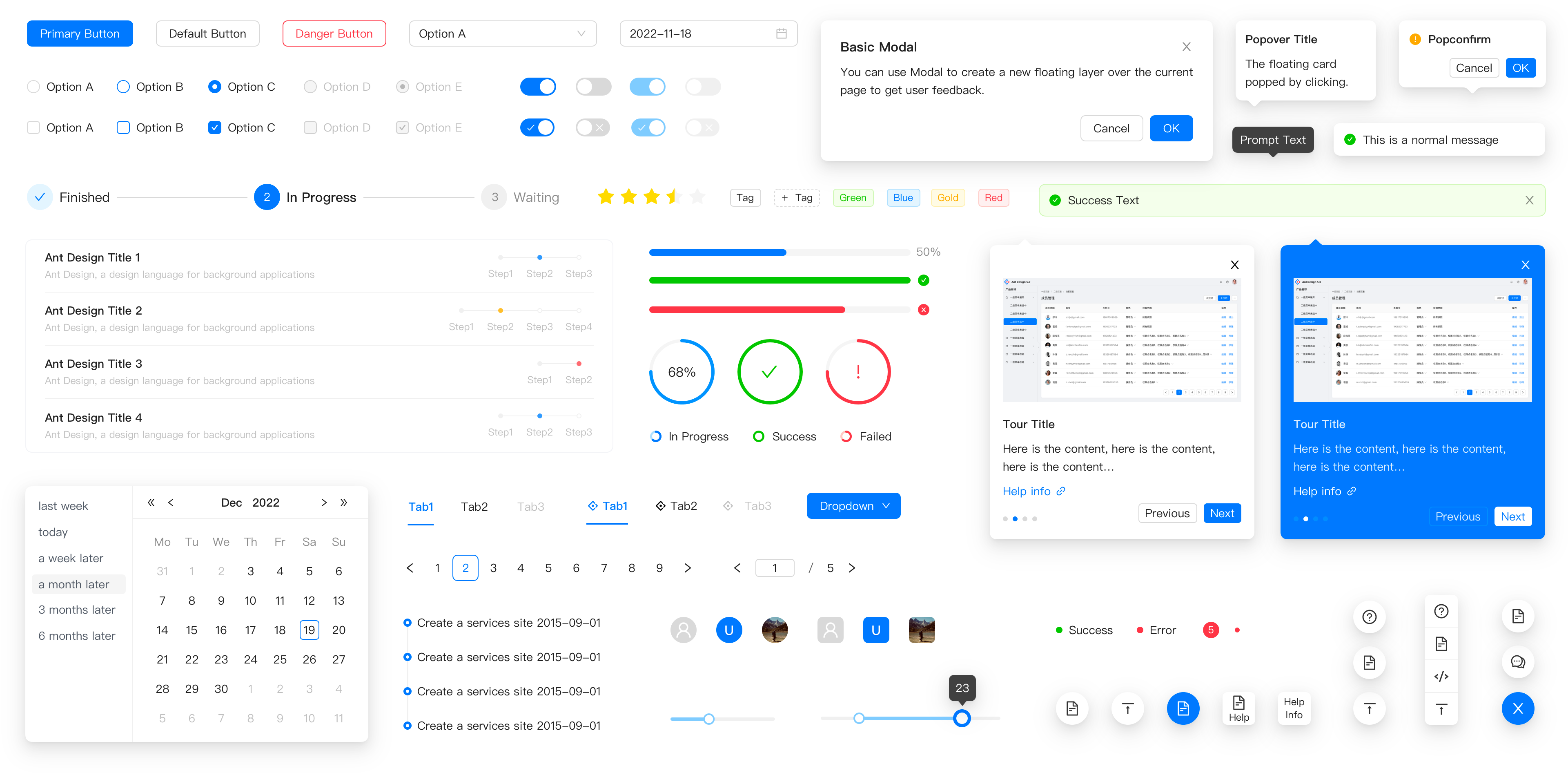
Ant Design (antd) is an enterprise-class UI design language and React UI library that gives teams a full set of production-ready React components, design resources and tooling for building web applications.
What it is
Ant Design is a React UI library and accompanying design language, written in TypeScript and published to npm as antd. It ships a set of high-quality React components out of the box, together with a whole package of design resources and development tools: the design language defines how enterprise interfaces should look and behave, and the library provides the React implementation of that language. It lives in the React and TypeScript ecosystem, with topics covering design-systems, ui-kit and ui-library, and it is maintained under the MIT licence.
The concrete problem it solves is the repeated cost of building enterprise application interfaces from scratch. Instead of hand-rolling buttons, date pickers, tables and form controls for every internal tool, a team installs antd and composes screens from components that already follow one visual and interaction standard. It replaces bespoke, per-project component sets and the ad-hoc design conventions that grow around them. The library is designed for web applications rather than marketing sites, and it supports internationalization for dozens of languages plus theme customization based on CSS-in-JS, so a single component base can serve multiple locales and brand treatments.
Key capabilities
- Enterprise-class UI component set designed for web applications, exposed through React imports such as
import { Button, DatePicker } from 'antd'.
- Written in TypeScript with predictable static types, so component props are typed at authoring time.
- Internationalization support for dozens of languages.
- Theme customization built on CSS-in-JS rather than preprocessed stylesheets.
- Environment support for modern browsers, server-side rendering and Electron.
- Browser support targeting the last 2 versions of Edge, Firefox, Chrome and Safari.
- Documentation and design resources delivered alongside the package, with the docs site built with dumi and hosted at
https://ant.design.
Who uses it and how
- Product teams building enterprise web applications, where the same component vocabulary is reused across many internal screens.
- React and TypeScript codebases that need typed, statically predictable component APIs rather than untyped UI dependencies.
- Applications that must serve users in many languages, using the built-in internationalization support instead of wiring per-locale component forks.
- Teams that need server-side rendering, since SSR is an explicitly supported environment.
- Desktop application developers building with Electron, which is listed as a supported target alongside browsers.
- Projects that need a customized visual identity on top of one component base, using CSS-in-JS theming.
Getting started
Install with npm install antd, or equivalently yarn add antd, pnpm add antd or bun add antd, then import components directly from the package. Documentation, the components overview and the design resources are available at https://ant.design, with the changelog in CHANGELOG.en-US.md and a Chinese README in README-zh_CN.md.
How it compares
No list of paid products that this project replaces is provided in the available facts, and no comparable sibling tools are named either, so on the evidence here Ant Design stands alone in this registry. Any comparison against commercial UI suites would have to be made on the MIT licence, which permits self-hosting and modification without a per-seat fee, but that case is not documented in the source facts.
When to use it — and when not to
The facts describe a client-side library rather than a hosted service, so there is no database, storage layer or SMTP configuration to operate: the cost of adoption is a dependency in a React and TypeScript project and a commitment to the Ant Design visual language. Teams not using React should not pick it, and teams that want to define their own visual system from scratch may find an opinionated enterprise design language constrains them more than it helps. The repository also carries 1066 open issues, which signals a large surface area and an active but heavily loaded issue tracker; the README itself is largely badges and links, with the substantive guidance living on the documentation site rather than in the repository text.